Sunday, 27 April 2014
Friday, 31 January 2014
Wednesday, 29 January 2014
Wednesday, 22 January 2014
Tuesday, 21 January 2014
Wednesday, 15 January 2014
Wednesday, 18 December 2013
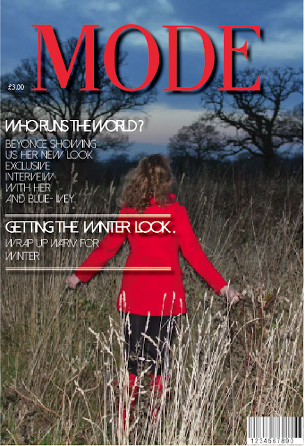
Mock Exam Magazine
This is one of the magazines I created in the mock exam. The aim was to keep it simple yet effective. Using a photo of Beyonce then changing it in illustrator and then placing it in In Design and adding texted in a type face on
"fine style"
"fine style"
Tuesday, 17 December 2013
Monday, 16 December 2013
Monday, 9 December 2013
Friday, 6 December 2013
Tuesday, 3 December 2013
Wednesday, 27 November 2013
Tuesday, 19 November 2013
Tuesday, 12 November 2013
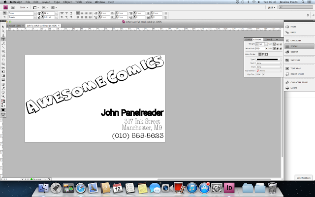
Johns awful business card.
This is the original business card of Johns however, this business card would be classed as 'Conflicting' as there is three different types on this card, however, they are all similar. A good business card is 'Contrasting' this means there would be three type faces on the card and they would be be all very different type faces another thing that makes a good business card is making sure the eye only has to move from one place to another only twice at the most making it quick and simple to read this makes it a fun good looking business card. If a business card was made up of text with the same type face that would be called 'Concord'.
 This is my business card and as you can se i have changed it quite a bit making it look better and easier to read.
All text added
Adding more text 4
I then added more text finding the right type face for them on 'Dafont' I then changed the colour, size, kerning and tracking.
Adding more text 3
I then added more text finding the right type face for them on 'Dafont' I then changed the colour, size, kerning and tracking.
Adding more text 2
I then added more text finding the right type face for them on 'Dafont' I then changed the colour, size, kerning and tracking.
Adding more text 1
I then added more text finding the right type face for them on 'Dafont' I then changed the colour, size, kerning and tracking.
Vogue Magazine - heading
This is the start of my magazine I started off with the heading. I did this b finding a similar type face as "VOGUE" I used 'fine style' I personally think this type face has used well.
Monday, 21 October 2013
Using Skew
Kerning
In these screen shots I am showing kerning. Kerning is where you can change how large the space between each letter is. The second the screenshot is showing where I have used kerning.
Friday, 18 October 2013
Drop shadow. - NME magazine
Thursday, 17 October 2013
Tuesday, 15 October 2013
Thursday, 3 October 2013
Final camera manual
Wednesday, 2 October 2013
New front cover to camera manual
This is my new front cover to the Camera Manual. I changed the colours of the camera so I have a running theme of colours through my work which as you can see is blue and orange. These colours contrast with each other making them stand out.
Camera Manual
Thursday, 26 September 2013
Front cover Camera Manual -these colours didn't work
Subscribe to:
Comments (Atom)


