Wednesday, 27 November 2013
Tuesday, 19 November 2013
Tuesday, 12 November 2013
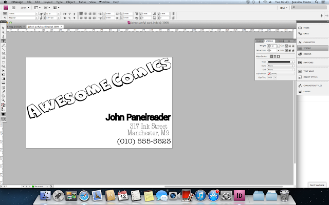
Johns awful business card.
This is the original business card of Johns however, this business card would be classed as 'Conflicting' as there is three different types on this card, however, they are all similar. A good business card is 'Contrasting' this means there would be three type faces on the card and they would be be all very different type faces another thing that makes a good business card is making sure the eye only has to move from one place to another only twice at the most making it quick and simple to read this makes it a fun good looking business card. If a business card was made up of text with the same type face that would be called 'Concord'.
 This is my business card and as you can se i have changed it quite a bit making it look better and easier to read.
All text added
Adding more text 4
I then added more text finding the right type face for them on 'Dafont' I then changed the colour, size, kerning and tracking.
Adding more text 3
I then added more text finding the right type face for them on 'Dafont' I then changed the colour, size, kerning and tracking.
Adding more text 2
I then added more text finding the right type face for them on 'Dafont' I then changed the colour, size, kerning and tracking.
Adding more text 1
I then added more text finding the right type face for them on 'Dafont' I then changed the colour, size, kerning and tracking.
Vogue Magazine - heading
This is the start of my magazine I started off with the heading. I did this b finding a similar type face as "VOGUE" I used 'fine style' I personally think this type face has used well.
Subscribe to:
Comments (Atom)


